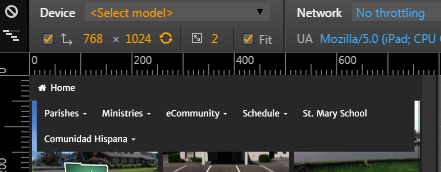
I recently ran into an issue with the navbar display (i.e. the menu) while working on a website redesign that utilizes the Bootstrap framework. For the iPad tablet, the device width is 768 px in portrait mode. When viewing the redesigned website on the iPad, the navbar was always uncollapsed. This didn’t look good in portrait mode because the menu rolled over into two lines:
One solution would be to use a smaller font in portrait mode, but when menu items get too small they become much harder to select on a touch device such as a tablet or smartphone. Instead, I decided it would be better to change the breakpoint at which the mobile “hamburger” menu icon appears. Below is the process I used to solve this problem.
Issue: For the iPad in portrait mode (width 768 px), the navbar does not collapse, instead it rolls over into two lines (ugly!).
To Fix: In order to fix this problem, I had to change the breakpoint where the navbar collapses and the mobile menu icon appears.
First try at a fix: I added some code to the website’s custom stylesheet which sort of fixed the problem, but it was not working smoothly (there was a problem with the dropdown menu and some of the menu items were overflowing their container. Obviously this initial fix was only a partial solution and additional styling was needed to make it work correctly. Rather than continuing to tweak the custom stylesheet, I decided to change the navbar breakpoint in the main Bootstrap stylesheet, bootstrap.min.css. To do this, I needed to change the breakpoint in the LESS files, then compile the bootstrap.css file, and finally minify the bootstrap.css file to get the bootstrap.min.css file used on the website. The procedure below outlines the steps I used to accomplish these tasks. (For those of you who are not familiar with LESS, here is a link to a helpful article on www.hongkiat.com)
Procedure: Change the breakpoint where navbar collapses, so that it will collapse on an iPad in portrait mode.
If you included the source code files in your Bootstrap download, you should have a “less” folder. The LESS file which sets the breakpoint for the navbar collapse is the variables.less file, around line 325:
// Navbar collapse
//** Point at which the navbar becomes uncollapsed.
@grid-float-breakpoint: @screen-sm-min;
//** Point at which the navbar begins collapsing.
@grid-float-breakpoint-max: (@grid-float-breakpoint - 1);
Notice in the above code that the breakpoint for uncollapsing the navbar is listed as @screen-sm-min. This corresponds to 768px, which is set around line 290 in the variables.less file:
// Small screen / tablet
//** Deprecated `@screen-sm` as of v3.0.1
@screen-sm: 768px;
@screen-sm-min: @screen-sm;
To make the navbar collapse for the iPad in portrait mode, I will change the @grid-float-breakpoint in the first set of code listed above as follows:
@grid-float-breakpoint: @screen-sm-min;
to
@grid-float-breakpoint: 769px;
Since the width of the iPad in portrait mode is 768px, setting the collapse breakpoint to 1px greater (769px) will ensure that the navbar will be collapsed in the iPad’s portrait mode.
After I make the change to the breakpoint in the component LESS file (variables.less), I will need to compile the bootstrap.css file and then minify the file to get a bootstrap.min.css file that has my new breakpoint. So, what’s the best way to accomplish these three steps? Below is an outline of how I did it.
Make the change to the LESS file
I use Adobe Dreamweaver for web development, so ideally I would like to be able to work on the LESS files and compile them using Dreamweaver. I found a Dreamweaver extension that will allow me to do this on the website dmxzone.com – the extension is called DMXzone LESS CSS Compiler. This site offers a ton of great extensions, templates, etc. The LESS compiler extension is one of their free extensions. Here’s a link to it:
http://www.dmxzone.com/go/21528/dmxzone-less-css-compiler
This tool can be installed with the Adobe Extension Manager or using the free DMXzone Extension Manager. After installing the extension, I opened the variables.less file in Dreamweaver and made the breakpoint change outlined above. The next step is to compile a CSS file with these changes.
When you save a LESS file in Dreamweaver with the LESS CSS Compiler extension installed, it will automatically compile a CSS file in addition to saving the LESS file. If the LESS file is included in another file, you have the option of compiling the file you are working on or you can select another file as the base file to compile.
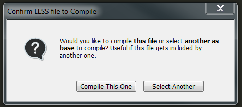
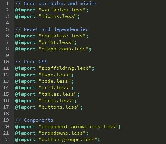
Since the variables.less file is included in the bootstrap.less file, you should click the Select Another button and select the bootstrap.less file. Dreamweaver will then create a bootstrap.css file (unminified) which has your new navbar breakpoint. This file will be located in the same folder as the LESS file (the less folder). Your variables.less file will also be updated and saved. The image below shows the bootstrap.less file – you can see that it includes the variables.less file
Now that you have the new bootstrap.css file, the next step is to minify it. You can’t do that in Dreamweaver, so you’ll need another tool. Again there are many tools out there to use – I tried two: SIMPLess and WinLess. I ran into some compile errors using SIMPLess, so I went with WinLess instead. Here’s a link to where you can download WinLess (it’s also free):
This tool will both compile your LESS files and minify your CSS files. We’ve already compiled the LESS file using Dreamweaver, so in this case we’ll only be using WinLess to create a minified bootstrap.css file.
- Download and open WinLess.
- In WinLess, click the Add folder button to select the folder with your LESS file.
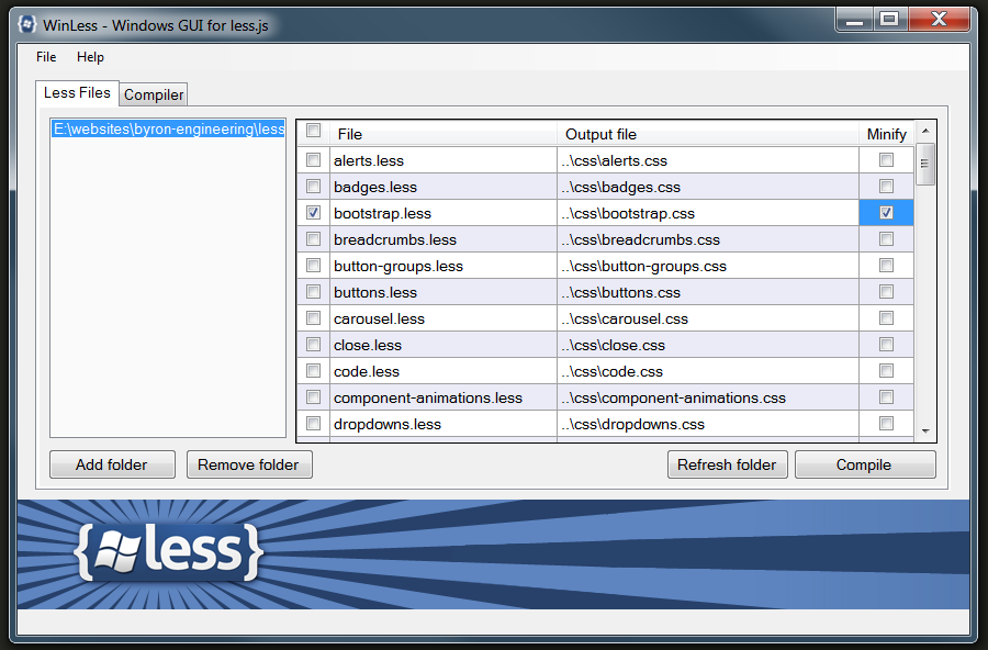
Check the bootstrap.less file and the Minify option. Note that you do not have the option of changing the file name for the minified file at this point and it will be saved using the same name as your unminified file, bootstrap.css. When you compile, the minified file will be saved to your CSS folder if you have one. You’ll want to rename this minified file to bootstrap.min.css. You can then move the unminified bootstrap.css file that is in your less folder to your CSS folder so you’ll have an unminified copy to look through when you are troubleshooting, etc.
- Click the Compile button, then select the Compiler If all goes well, you should see “success” listed in the Compiler Result field.
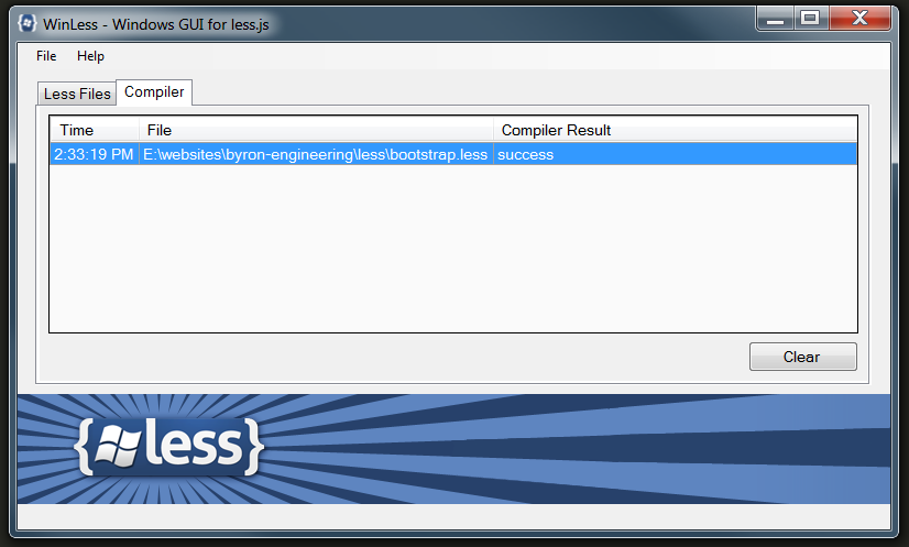
- Next, in your CSS folder rename the new minified bootstrap.css file to bootstrap.min.css. Copy your unminified boostrap.css file to your CSS folder.
You should now have revised minified and unminifed bootstrap CSS files with your new breakpoint. Note that the minified version will be about 25KB smaller.

Recent Comments